Showing posts with label Colored Pencils. Show all posts

Bullet Journal Cover Pages

 I had some fun in my bullet journal during October and November of 2020 by using doodles throughout the pages.  I usually use washi tape and stickers - and I did go back to that in December, but October and November were all doodles.  

I picked up on that habit in the 2021 bullet journal.  So far, for January, February, and March, it's been doodles all the way.  I have also added a cover page to each month - I've never used a cover page before. These are designed with a large doodle and a quote.  They are inspired by doodles I see on the internet (so know that).  

I can't draw, but I enjoy this.


One Image, Five Ways


At the end of May, we spent the weekend at Snowshoe Resort.  Go look at that link - great place to go. Absolutely beautiful mountain top resort.

While I was there, I colored the flower images from the Simon Says Stamp June kit five times (images on right of line of art).  I used different paper, different media, and different colors.  Fun.

Here are the cards:

On Graytoned paper with Gray polychromos pencils

On watercolor paper (Tim Holtz) with watercolor

On either bristol or Neenah Solar White with Zig Clean Color Real Brush Markers

On Nennah Solar White with Polychromos pencils

On Desert Storm paper with polychromos pencils

Colored Pencil debate (with myself)

I'm continuing my study of Prismacolor versus Polychromos colored pencils.  I purchased three red polychromos pencils so that I could do a good comparison between the blending of them against the prismacolor.


One of these was colored with Prismacolored pencils (the bottom one); the other with Polychromos.  A few differences:

  • You might be able to see (in the terrible picture) that the prismacolor leaves a waxy finish. That isn't present with the polychromos - you're able to add more color layers with the polychromos.
  • The prismacolored pencils are softer, and may be better for larger areas.  The polychromos are harder, and might be better for more detailed images.
  • The prismacolored pencils, when you add too much color, shed onto the paper around the image. This I Really Don't Like.
  • The polychromos don't break like the prismacolored pencils do. I can sharpen them to a better point, and they hold the point.  Also, there is less breakage inside the wood of the pencil - that drives me crazy with the prismacolored pencils, and results in wasted pencils.  
I'm still not sure what I'm going to do, but at this point I'm thinking I could use the difference kinds of pencils for different projects.  Also, the shedding of color outside the image and the breakage are really turning my heart away from Prismacolor.

Colored Pencil Details


This card is made with Altenew's Carnation Build-a-flower layering set.  I used four Lawn Fawn inks - Wild Rose, Guava, Lobster Red and Chili Pepper.  The problem is that there isn't enough contrast between those four inks for the flower to have any depth. I didn't realize that until I had stamped six of the carnations and made three cards.

I try to fix it, I added some detail work with colored pencils. I did help. The flower on the top has colored pencil work; the one of the bottom doesn't.  It's easier to see in person.

Next time - more contrast. Nice stamp set, though.

Lots of Balloon cards

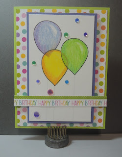
Not one to let any coloring go to waste, here are the cards I made with the Prismacolor vs Polychromos balloons:


Primsacolor vs Polychromos

I've been watching lots of Youtubers use Polychromos pencils instead of Prismacolor pencils, so I started wondering if I should investigate the Polychomos. I own a large number of Primsacolor pencils, so I wanted to know if it would be worth an investment to change.

I purchased a pack of 12 Polychromos pencils from Amazon and gave them a head to head comparison.

The pack of 12 pencils was limiting, especially since I wanted to see how the colors blended - hard to find pairs of pencils among 12 that would be close enough to blend.  Below are the Polychromos I pulled and the Prismacolors I pulled to try to match them.

Prismacolor Pencils
Polychromos Penscils

Add caption

Part of what I wanted to do was compare the color intensity on different kinds of paper, so you'll see three head to head comparisons below:

Primsacolor on the left, using Neenah Solor white paper

Primsacolor on the left, using Neenah Desert Storm paper.

Primsacolor on the left; black paper
Conclusions:

  • Primsacolors are wax-based pencils; Polychromos are oil-based.  That did make a difference in the way you can layer color.  Once there is a lot of wax from the Prismacolors, there isn't much more that you can do.  You probably can't see it in the pictures, but I could see a big difference in sheen - the Primsacolors had a waxy shine.
  • I didn't really have the right pairs of colors to check out the blending abilities of either set, so no answer there. I know the Prismacolors do blend well (from other work I've done with them).  
  • I didn't worry about sharpening the Polychromos, because from what I read, they aren't prone to breaking. I never really know when I use the Primsacolors if they are going to break.
  • Other than the waxy coat, I didn't really notice much difference between the two.
So, I still don't know. Nothing in what I did convinced me to go out immediately and start buying Polychromos, but maybe something will later? I haven't decided yet. But it's fun to play!

Multitasking


A couple of weekends ago I attended a conference. At the tables were coloring pages and colored pencils. I tried to resist. Really, I did. But there was this black and white page and pencils and who could resist! At first, I just colored during the break, but then I found myself drawn back to the page, so I colored and listened. That must have been what they wanted people to do, right? Why else put them on the table?

I did learn that I can listen and color at the same time. I kind of knew that, but this confirmed it.

The whole time I kept thinking that I could do a better job with my own (much larger) collection of colored pencils. Who can color with just 10 color choices, anyway?

Oodles of Doodles - May


I've mentioned before that The Petit Planner on Instagram publishes a monthly doodling challenge.   In  May, the challenge was a list of foods.  It's fun to do - and fun to think of creative ways to interpret the words.

Some of my favorites this month were cookie (I drew the Cookie Monster) and hamburger (Hamburgler).

Prismacolor on kraft paper

I spent some time playing with colored pencils this week. The card front to the right was made by stamping with Hero Arts black ink and using the stamps from the March My Hero Kit. I drew the stems using a black fine line sharpie (not my usual choice, but it was what I had handy). The paper is kraft paper from My Favorite Things.

I colored the images using Prismacolor pencils. The normal way of coloring of kraft wouldn't provide vibrant color (I imagine), so first, I colored the flowers, stems and bees with the white Prismacolor pencil.  I then added color with the colored pencils. Each image has two of three colors, blended together. I approached it with a Copic mind set - adding the colors, blending, then adding the colors again - from yellow to orange to pink, and then orange to yellow. That seemed to provide good blending. I then used the sharpie to add the lines back (obscured by the pencils).

I like how it turned out. I'm not sure what kind of card it will be, but I imagine a sentiment at the top. We'll see what kind of card I need next - that will dictate the purpose.