Seattle Yarn


Pretty yarn, right? I purchased this at So Much Yarn in Seattle.  It is a California yarn, specifically dyed for this store.  It's La Jolla yarn from Baah Yarn, and the colorway is Market Flowers.


It is a perfectly appropriate colorway name considering the number of flowers for sale in this city, espeically at the Market.

Colored Pencil debate (with myself)

I'm continuing my study of Prismacolor versus Polychromos colored pencils.  I purchased three red polychromos pencils so that I could do a good comparison between the blending of them against the prismacolor.


One of these was colored with Prismacolored pencils (the bottom one); the other with Polychromos.  A few differences:

  • You might be able to see (in the terrible picture) that the prismacolor leaves a waxy finish. That isn't present with the polychromos - you're able to add more color layers with the polychromos.
  • The prismacolored pencils are softer, and may be better for larger areas.  The polychromos are harder, and might be better for more detailed images.
  • The prismacolored pencils, when you add too much color, shed onto the paper around the image. This I Really Don't Like.
  • The polychromos don't break like the prismacolored pencils do. I can sharpen them to a better point, and they hold the point.  Also, there is less breakage inside the wood of the pencil - that drives me crazy with the prismacolored pencils, and results in wasted pencils.  
I'm still not sure what I'm going to do, but at this point I'm thinking I could use the difference kinds of pencils for different projects.  Also, the shedding of color outside the image and the breakage are really turning my heart away from Prismacolor.

Colored Pencil Details


This card is made with Altenew's Carnation Build-a-flower layering set.  I used four Lawn Fawn inks - Wild Rose, Guava, Lobster Red and Chili Pepper.  The problem is that there isn't enough contrast between those four inks for the flower to have any depth. I didn't realize that until I had stamped six of the carnations and made three cards.

I try to fix it, I added some detail work with colored pencils. I did help. The flower on the top has colored pencil work; the one of the bottom doesn't.  It's easier to see in person.

Next time - more contrast. Nice stamp set, though.

Northern Lights Scarf


Once upon a time I was in a yarn store, and I fell in love with one of these two skeins of yarn (I don't remember which one).  It's Mountain Colors 4/8s wool in the colorway Northern Lights.  I bought one skein.

That's not really enough to do anything with (250 yards).  I don't know why I didn't buy two skeins at the time - whether it was price, availability, or just absent mindedness.  Later, I decided I wanted to knit a scarf, so I took a chance, and ordered another skein.  It's the other one in the picture.

Handpainted yarns may not be at all the same from one lot to another, and that's the case with these. They are mainly the same, but the one of the right has yellow in it - the one on the left does not.

This yarn has been sitting in my stash forever. I love how this yarn will knit in a scarf - the colors make patterns on its own.  But the only way to cure the difference between the two (so that the scarf is uniform) is to altnerative the two skeins - knit two rows and then switch.  If I did that, I would lose the natural patterning of the colors.

I couldn't make up my mind.

So, last week, I wound the yarn into balls, and just decided to go for it. One skein at a time, and I'll end up with a scarf that is mainly the same, but sort of different.  And that will be OK.

I'm using the Yarn Harlot's one row pattern.  I love this "pattern" and have used it multiple times.  I'm using US size 7 needles.


And there is the beginning. See the patterning?  Love it!

Snowshoe Scarf completed

Back in May, I wrote about a scarf I was knitting - the details are at this link.  I started it when we went to Snowshoe - I picked the yarn because the color was "snowshoe."

I finished the scarf this January - really, I can knit much faster than that, but I haven't been knitting much, so the scarf just sat around. It seemed fitting to comlete it when we returned to Snowshoe the first week of the year. I took the pictures of it from our room.


Oodles of Doodles

I participate in a doodle challenge each month called "Oodles of Doodles" by @the.petit.planner on instagram. If you want to see all of them, you can check out my instagram feed at @mom4gj

I can't draw, but I enjoy playing.  Here are a couple of month's worth:


Lots of Balloon cards

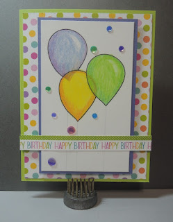
Not one to let any coloring go to waste, here are the cards I made with the Prismacolor vs Polychromos balloons:


Primsacolor vs Polychromos

I've been watching lots of Youtubers use Polychromos pencils instead of Prismacolor pencils, so I started wondering if I should investigate the Polychomos. I own a large number of Primsacolor pencils, so I wanted to know if it would be worth an investment to change.

I purchased a pack of 12 Polychromos pencils from Amazon and gave them a head to head comparison.

The pack of 12 pencils was limiting, especially since I wanted to see how the colors blended - hard to find pairs of pencils among 12 that would be close enough to blend.  Below are the Polychromos I pulled and the Prismacolors I pulled to try to match them.

Prismacolor Pencils
Polychromos Penscils

Add caption

Part of what I wanted to do was compare the color intensity on different kinds of paper, so you'll see three head to head comparisons below:

Primsacolor on the left, using Neenah Solor white paper

Primsacolor on the left, using Neenah Desert Storm paper.

Primsacolor on the left; black paper
Conclusions:

  • Primsacolors are wax-based pencils; Polychromos are oil-based.  That did make a difference in the way you can layer color.  Once there is a lot of wax from the Prismacolors, there isn't much more that you can do.  You probably can't see it in the pictures, but I could see a big difference in sheen - the Primsacolors had a waxy shine.
  • I didn't really have the right pairs of colors to check out the blending abilities of either set, so no answer there. I know the Prismacolors do blend well (from other work I've done with them).  
  • I didn't worry about sharpening the Polychromos, because from what I read, they aren't prone to breaking. I never really know when I use the Primsacolors if they are going to break.
  • Other than the waxy coat, I didn't really notice much difference between the two.
So, I still don't know. Nothing in what I did convinced me to go out immediately and start buying Polychromos, but maybe something will later? I haven't decided yet. But it's fun to play!

Chicago

These are images of Chicago from October, taken with my iPhone.  It really does a good job, doens't it?


Thank you

I took this stamped image with me to Chicago in October.  It's a Penny Black stamp (Poppy Time).  I colored it with prismacolor markers (while in Chicago) and added highlights and splashes of gold water color paint.

I then left it in the room (as is) with my tip for housekeeping.

Gratitude Quotes

As part of my bullet journaling this week, I’ve been finding a gratitide quote each day. These are the ones I including in my journal:

  • I don’t have to chase extraordinary moments to find happiness - it’s right in front of me if I’m paying attention and practicing gratitude (Brene Brown).
  • Gratitude can transform common days into thanksgiving, turn routine jobs into joy, and change ordinary opportunities into blessings (William Arthur Ward).
  • Joy is the simplest form of gratitude (Karl Barth).
  • Gratitude unlocks the fullness of life. It turns what we have into enough, and more. It turns denial into acceptance, chaos into order, confusion to clarity. It can turn a meal into a feast, a house into a home, a stranger into a friend (Melody Beattie).
  • Gratitude changes the pangs if memory into tranquil joy (Dietrich Bonhoeffer).
Image Notes: Created using iPhone 7. No adjustments made.

Scent of Gratitude


I am a knitter, and as a knitter, I read knitting blogs. Now that I don't knit quite as much as I used to, I've narrowed my knitting blog list down, but I still enjoy Carole knits. She posts several times a week - and only a small part of what she posts is about knitting. Her blog is mainly a chronicle of her life, and I enjoy seeing her photography, reading her stories, and, yes, checking out her knitting.

She does a regular Thursday (I think it's Thursdays) post called Three Things.  This week's three things was Three things that are the scent of gratitude for you.  That one intrigued me, so here's my three things:

  1. Steve's cologne - Ever since we strarted dating, Steve has worn the same cologne. I hope they never stop making it, because, for me, it is Steve's scent.  It's Lagerfeld.  I love how it smells, I love it on Steve, but most of all, when I smell it, I am grateful for my wonderful husband.
  2. At Rotary last week, the guest speaker was the owner of Charleston Bread. Listening to the owner talk about the bread she bakes and seeing pictures of it had me craving her bread.  So, on Thursday evening, I stopped at the bakery on the way home to pick up a loaf of bread to go with our spaghetti for the evening. The store has a small parking lot next to it. After I parked, and got out of my car, I could smell the bread baking.  That is the scent of gratitude for me. Baking bread.
  3. Around here, we are starting to think about Thanksgiving. Thanksgiving has a certain smell, doesn't it? Turkey cooking? It is the scent of gratitude for me - it reminds me of family gathered around the table, sharing a meal.


What scents are scents of gratitude for you?

Nametags


I belong to a digital alumnae chapter of Alpha Chi Omega. We meet most often via Facebook and email, but once a year, the group gathers for a Founder's Day breakfast with the Collegiate Chapter we support.

This year and last year I was asked to stamp nametags for the gathering. In this image are 120 approximately business sized nametag inserts for plastic holders. The carnation is from Garden Charmers by Penny Black, stamped with Lobster Lawn Fawn ink and Moss Hero Arts ink. The lyre is from a very hold Hero Arts wooden block set, stamped with embossing ink and embossed with fine gold powder. The paper is MFT sweet tooth - an almost white card stock.


The misti tool was a great help with these; I also used the new corner set to pull the card stock away from the Misti corner but still have a "corner" to position it with.

World Cardmaking Day


A couple of Saturdays ago was World CardMaking day. I would love to have had a long period of time to make several cards, but I didn't have that kind of time that day. I did sneak in one card, though.

This one is influened by Lisa Spangler (https://sideoatsandscribbles.wumple.com/) from Texas. The state outline is from Studio Calico. The mountains in the state are made from curved lines drawn with zig clean color real brush markers with the color spread out using a waterbrush. 


I like the look of the card and have already sent it off to remind someone far away that he is thought about.

Multitasking


A couple of weekends ago I attended a conference. At the tables were coloring pages and colored pencils. I tried to resist. Really, I did. But there was this black and white page and pencils and who could resist! At first, I just colored during the break, but then I found myself drawn back to the page, so I colored and listened. That must have been what they wanted people to do, right? Why else put them on the table?

I did learn that I can listen and color at the same time. I kind of knew that, but this confirmed it.

The whole time I kept thinking that I could do a better job with my own (much larger) collection of colored pencils. Who can color with just 10 color choices, anyway?

Three Things not on a Thursday

Carol at Carol Knits does a weekly post on her blog called Three Things on Thursday. I was thinking about what to write about this week, and that prompt of hers came to mind.


  1. I ordered a new fountain pen a couple of weeks ago. It's a TWSBI Eco.  I ordered the one with no color with a fine nib. It's a demonstrator pen - the first one I've owned.  I filled it with Diamine Ancient Copper ink. I anticipate that I'll be using it for the headers in my November bulletin journal.
  2. I ordered this traveler's notebook cover through Amazon. It's a really pretty brown leather, and not very expensive. I really want this one, but decided to go with a less expensive one for now to see if it will work for the purpose I'm planning for it. I think this will take the place of my Plum Paper planner. I love the Plum Paper planner, but I only use it to plan my work as communicaton coordinator at my church - it's really more than I need. I created an insert for the traveler's notebook with my weekly spread for my work at church. I ordered an undated monthly insert from Penguin Paper Co. on Etsy. We'll see how it works.
  3. I pulled out my crochet hooks this evening to fix a "run" in my mom's prayer shawl. I told her I wouldn't be able to match the pattern. She didn't care: "put a flower on it." So I did.

Watercolor Cards

I've been playing around with drawing and watercolor - oddly enough, with fruit images.


Flower Card

While we were in Pittsburgh at the end of August, I worked on some art while Steve rode his bike in an event. The front panel and cards below it were a product of that time.

The flowers on the card were stamped using stamps I received from my mother's cousin, who used to stamp, but doesn't any longer. I drew in the leaves to fill out the design.  The paper is Nennah Desert Storm, and I colored the images with prismacolor pencils.   I like how it turned out.

Prismacolor pencils look different on kraft cardstock - trying out different combinations.

Completed front panel with the pencils I used

Finished birthday card

How you Bean?

Our son's birthday was at the end of August. When he was growing up - when he was learning to talk - he would point to jelly beans on the counter, and say, "Bean." Joshie Bean became his nickname among the family - really only among his parents.

For his 21st birthday, I used the Lawn Fawn How You Bean? set to create his cards.  I made a series of four cards, and on each one, the jar was more full of jelly beans, until it was overflowing. I mailed a card to him each day, so that they arrived gradually, up to his birthday.

Here are the card fronts:


Weekly Layout

One of the ways I express my creativity is through Bullet Journalling. I've mentioned that before.  

There are so many (so so many) people in the blogging, pinteresting, youtubing world who are "doing" bullet journalling, and sharing their work, that it seems redundant for me to do so here. But... here I go, anyway. Over the next few weeks, among my other posts, I'll share a few of my regular layout styles - what they are, why I use them, etc.


This is a weekly layout. I do one of these pages on Saturday evening, in preparation for the week. On the top half of the page, I list each day of the week with a column for schedule and a column for deadlines. The schedule side are events that I need to remember; the deadline side includes items I need to remember to do by that day.

On the bottom of the page, I list three goals for the week, I track fitness (steps, stairs, a personal rating of my food tracking and weight change for the week), and I list potential meals based on the groceries in the house.

This layout helps me to see the week all on one page. It isn't my To Do list, and it doesn't serve to record what I HAVE done that week - it is only a look at the week before it happens.

This layout developed over time, but at this point, I think it serves me well.