Travel images

How about some images from our recent weekend trip? These were taken with our Nikon 5100 (details about our camera at this page).

Bird on post, near Summersville, WV

Blue flowers - what kind? Near Summersville Lake

Near Summersville Lake.

Female cardinal near Gnats Run, WV

Male cardinal near Gants Run, WV

Cathedral Falls near Glen Ferris, WV

White dogwood in Summersville

Process vs Project Card Making

I was thinking about card making today. I was kind of regretting that I hadn't had much time to just "play" with my stamps and supplies. For me, playing means to explore media, to pull a set of stamps and see what I can do with them, to experiment, to use up a card kit - playing is a great creative outlet.

In knitting, there are process knitters and project knitters. Process knitters mainly enjoy the knitting of the object. The goal for a process knitter is not really the finished product - it is the knitting, The ultimate story about process knitters that I've heard is women in a eastern European country (I think) who couldn't get yarn, so they would knit a pair of socks, frog the knitting, and then knit the socks over and over again, just for the pleasure of knitting.

Project knitters are in it for the end product. When I knit a gift for Christmas, with a fixed deadline, and a rush to finish, I am a project knitter. I just want to get to the end, where I have the scarf or the socks and can wrap them and call it all done. I don't enjoy the knitting as much.

Today, I realized that the same can be thought of in card making - sometimes I am a project card marker and sometimes I am the process card maker.

  1. When I make cards for the people on my list, I am a project card maker. This month, I needed to make 11 Mother's Day cards, 7 "event" cards (birthday and anniversary) and a few other, non-categorized and non-planned cards (Get Well, Thinking of You. I've been pushing to get this list done for a few weeks. Today I finished the Mother's Day cards, and I have two more event cards to make for the month. I enjoy doing it, don't get me wrong, but there isn't a lot of "play" in it.
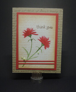
  2. Sometimes, I just sit down and enjoy the process. I end up with cards, but they aren't for particular people. For example, the card in the image with this post is a Suzy Plantamura pre-made print. I took it with me when I had time to color during breakfast, and colored it in with Zig Clear Color watercolor markers. Later, I took the finished piece, mounted it, and made it in to an anniversary card for a couple on my list.
It seems to be a small difference, but the first way feels as if I am working toward a deadline. The second way feels less stressful and more like play. It in in the process that I learn new skills, usually, because I'm trying new techniques. It's in the play that I grow as an artist.

I need to remember to take tame to play - not just to make cards.

Lydia's scarf

This is Lydia's scarf. It is also a lesson in how, if I don't write things down, I won't be able to remember them.

I knit this in December for our son's finance.  The picture is bad and my memory of the detail of the knitting supplies is bad. But I'll do the best I can:

Pattern: Ripples from Knitpicks (this much I know).
Yarn: Wool of the Andes Superwash bulky (I think), 3 skeins (maybe)
Color: Aurora Heather
Needles: Size 9

My soon-to-be daughter in law is tall (almost 6 feet), so I knit the scarf to be six feet long. I worked hard to finish is by Christmas, and measured it wrong - it was probably at least 7 feet long when I finished.

I like the look of the pattern, and it didn't take too long to memorize. I'm unhappy with the edges and how they curled. It could be the way I knit it, though, and not a function of the pattern itself.

Also, I was in such a rush to finish it and wrap it that the images of it are bad. This one is heavily edited in Photoshop to try to get the color close to correct - it's ok, but not quite right.

Lessons learned - write details down, take better images, measure better, and work on the edges.


Oodles of Doodles

I am creative; I can stretch that to say I am artistic. What I am not is a person who is able to draw. That would be a great gift, and it is a gift my older son has. He didn't get it from me.

However, I was scrolling through Instagram the other day, and Stephanie Klauk posted an image of her bullet journal - the page where she was working through the Oodles of Doodles challenge for April. It's a list of prompts - 30 of them - and for each of them, you use the prompt to lead you in a doodle.  A few example prompts for April are tulip, bunny, ants, picnic - you get the idea.

It looked interesting  and as I said, I can't draw. But I CAN play. So I grabbed the list from The Petite Planner's Instagram feed, and created a spread in my bullet journal.

The drawings are doodles. They aren't great - as I said, I can't draw. But it is fun. And it reminded me about something important regarding creativity. You don't have to be good at something to do it. Do it anyway. Play. Create. Have fun expressing yourself.

My Raskog Cart

Top Shelf
 I have a cart that sits near my studio desk - it's a Raskog cart from IKEA.  When I was setting it up, I looked around the internet for ideas - and didn't find many. So, this is how I set it up.

Top Shelf:
  • Box with stamps I want to use soon. In particular seasons, this turns into seasonal stamps (like Christmas).
  • Box with precut papers I can use for the inside of the cards, bags I use to put finished cards and envelopes together and other small papers.
  • Basket with towels for cleaning (paper and cloth).
  • Scoreboard and Misti

Second Shelf
 Second Shelf:
  • Two baskets of embossing powders: metallic and colors
  • Coffee filters for embossing
  • Box of acrylic box which also contains basket for ink blending tools and ink swatch stamp.
  • Small basket of long strips of paper for sentiments
Third Shelf - one side
 Third shelf:
  • Basket of large cling rubber stamps (especially backgrounds and Penny Black)
  • Jar of finger blending tools
  • Jars of water for watercoloring
  • Pencil cases - Prismacolor (the large one), Derwent Inktense and Derwent watercolor


Third shelf - other side

I love my cart. It has made staying organized, and having everything handy for when I need it so much easier. One of my favorite purchases! I also enjoy using baskets to help keep everything organized on the cart. I enjoy how they look. The exception to this is the acrylic blocks, which are in an acrylic storage box.

Easter Cards

 I'm working on Easter cards this week, and I feel in love with Cottontail Cuties from Neal and Tangled.  I belong to an accountability group (called an Emmaus Reunion Group) - I've made cards for each of these women - 7 of them.

As I worked on the cards, I thought a post about these cards - step by step - might be fun to do.

I stamped the images in Hero Arts Black dye ink on Neenah Solar White 80 pound card stock - I like both of these for colored pencils.  I masked the little girl's hand and stamped the carrot, so that it looked like she was holding it. I wanted a soft look, so I used Prismacolor pencils (instead of copics). This design is very much inspired - if not stolen - from Laura Fadora - at this link.  Watching her video inspired me to purchase the stamp set.


I masked the images with post-it notes, and then used Inc. makeup brushes from Target to brush on Distress Ink (Twisted Citron and Broken China) for the grass and sky. I added a few pencil strokes in green to provide ground and blades of grass. I wish I could remember where I saw the idea of using the makeup brushes - they are a substitute for the more expensive Clarity Brushes. This is the first time I've tried them - I loved the light touch of ink they provide. I never could have gotten this soft of a background with the ink applicators I usually use with distress ink.

The panel is mounted on a frame and card base from My Favorite Things.  Seven of them ready for Easter!

Incowrimo - Encouragement Cards

Have you ever heard of incowrimo? It is an abbreviation for International Correspondence Writing month.

Since I started bullet journaling, I've been watching videos by Boho Berry. She participated in incowrimo - at the time I thought it required you to write a 28 letters in February. Cool idea - handwritten letters.

I didn't want to write letters, but decided to accept that challenge and send out 28 handmade encouragement cards in February. You can tell, if you know anything about incowrimo, that I didn't actually go check out their website - until today, as I write this post.  According to the website, "InCoWriMo challenges you to hand-write and mail/deliver one letter, card, note or postcard every day during the month of February." So, my card commitment was write in line with challenge - it doesn't have to be letters.

At first, I thought 28 encouragement cards was a stretch goal Keep in mind that I didn't count the ones I made for Valentine's Day. As the month went on ... Wow. Not just a stretch goal - it was a big commitment.

And yet, the whole process reminded me of why I send out handmade cards. The recipients were surprised - cards for no reason. A "happy" as my mother-in-law would have called it. People need that kind of encouragement, don't you think.

Will I do it next year? Maybe. It was worth it.

(By the way, the image was taken in a grocery store florist department with my iPhone - some day soon I'll write a post about my image a day for a month commitments.)

Bike Doodles

 In December, I started learning about bullet journaling. I decided to give it a try. That month, I pulled a blank book I had on my shelf and a couple of pens, and started giving it a try.

I liked it, so in January of this year, I started bullet journaling daily. I'll write a post about the process I use later - you can see my supplies at this link.

This morning, I was planning for the day. Steve had a bike ride on his schedule, and I wanted to include that in my day. I decided to work on a doodle of a bike that I could draw on my page. I started with a page in the back of my book, a google of bike doodles, and finally with the picture of Steve's bike that is to the right.

It's still a work in progress - I like the one on the bottom row, far right side the best, but fun to play with.

Doodle on.


Fountain Pens and Ink

I've become interested in foundation pens. Years ago, as a kid, I used a foundation pen, and I played around with calligraphy using a foundation pen with a calligraphy nib.  So this is a renewed interest.

My current pens are:

  1. Pilot Metropolitan, violet leopard with a fine nib.  This is a great pen. It was inexpensive, and yet it writes very smoothly - flows across the paper. It comes with a converter and a cartridge so that you can choose which method of adding ink you prefer. I started with a cartridge and then switched to a converter to use bottled ink.
  2. Platinum Plaisir, green with a fine nib. I like this pen, too. It doesn't write as smoothly as the Metropolitan, but it still does a good job.  When I purchased it, I also purchased a converter (which doesn't come with this pen.
  3. Parker Vector 88. This isn't my pen. It belonged to my husband's grandmother. He bought it for her as a gift, and when she died, it was returned to him. When he saw my interest in these pens, he dug it out for me to use. It still had the cartridge in it that she had used, although it was empty of ink (or dried up). I worried that the dried ink would have ruined the feed or the nib, but cleaning it was rather easy, and it was restored. No one has used it for about 20 years, and now it's working just great. I purchased a Parker converter for it.
Inks I've tried:
  1. Blue-Black Pilot cartridge - this worked as expected, but I wanted to try something a little bit brighter.
  2. Diamine emerald - It's a nice green ink, but it leans more toward yellow green than bluer green.
  3. Noodler's Green Marine - I like this one better than the Diamine Emerald because it is a bluer green. Personal preference.
  4. Diamine Blue Velvet - Great blue ink. I like it
  5. Pilot Iroshizuku Ku-jaku - a deep teal blue-green ink - peacock. This is the ink I put in the Parker 88.
You'll see that for most of the inks above I've linked to samples from The Goulet Pen Company. They have a nice option that offers small samples of bottled ink to try. Great idea - and it has allowed me to try several before I buy a whole bottle.  The Iroshizuku link listed above was a "surprise" ink. It's another option they offer - you can purchase a randomly selected sample of ink.  Fun idea!

For those interested in finding more out above fountain pens, I recommend The Goulet Pen company Youtube page. It's what drew me into to exploring this world again.

FYI - the notebook above is a Leuchtturm 1917 journal that I use for Bullet Journaling.

Lobster scarf and Maine

In October of last year, Steve and I traveled to Portland, Maine, for a NAUMF meeting. It was a great trip!

While we were there, we visited a yarn shop called KnitWit. I like to purchase "souvenir" yarn when we travel - yarn that I can knit into a finished object (usually a scarf) and when I look at it, I remember the trip. I bought three skeins of Lark yarn from Quince & Co. in the colorway Peaks Ferry (which is red). Since then, I have knit it into a scarf.

I love blue yarn, but I steered myself away from it on this trip, just to have something different.  As I was checking out, the very nice clerk said that this would remind me of lobsters - very true!  See, souvenir yarn.

And we did go to a Lobster Bake while we were there.

Details:
Yarn - Quince & Co. Lark yarn, 100% wool, 3 skiens
Needles - Size 7, I think - I bought them on site at the store
Pattern - Yarn Harlot's one row scarf pattern - one of my very favorites.

Portland and the surrounding area is beautiful. On the Saturday we were there, we rented a car and went Lighthouse hunting.  We were able to find several:

  • Bug Light
  • Spring Point Ledge lighthouse
  • Portland Head lighthouse (pictured)
  • Rams Head Light 
  • Two lighthouses from Twin Light State Park
The image of Portland Head Lighthouse was taken with my Nikon CoolPix P330.  I left the "big" camera at home, so all of my Maine pictures were taken with my CoolPix or my iPhone camera.

Spring is on the way

I was playing around with color earlier in the week.  The first image is from Penny Black - called Poppy Time.  It's a rubber stamp (not a clear stamp), and, I have to say, it's one of my favorites. I use it all the time.

I stamped it on Strathmore Bristol paper and then colored the image with Zig Clean Color Real Brush markers. I haven't had a lot of luck with them, but this time, it all seemed to work.  I often color this card with reds or orange-reds (like a poppy), but this time, I used teals, aquas and green.  I really like the effect.

The second image is from the set of pre-printed images called Full Bloom, drawn by Suzy Plantamura on Tim Holtz watercolor paper. The set is from the New Beginnings release at Simon Says stamp.  This is also colored with the zig real brush markers.

I like the pre-printed images - although they make me nervous.  With a stamp, I can always re-stamp if I make a mistake.  Not with these. One shot.  That aside, I like them, and I like the convenience of grabbing them and taking them to color outside of my studio.  These are all great flowers. I look forward to coloring them.

I've already turned both of these into cards.  I mounted the top one a narrow black mat and then on Tropical Teal (MFT) card base. I added some glimmer with a Spectrum Noir sparkle pen and a few blue and green glimmery sequins.  I white heat embossed Happy Birthday on black card stock (narrow strip) and backed that with a black and white stripe washi tape.

I trimmed the hydrangea, and mounted it on lavender and light blue cardstock. I added three clear droplets from Pretty Pink Posh.  This one has no outside sentiment, but became a get well card.

Cards for a Good Cause

I am a member of Alpha Chi Omega, and of a digitally-based alumnae chapter, Rho Phi Rho, formed to support our local collegiate chapter, Gamma Omicron.  You don't need to really know any of this, except I'm offering a group of handmade cards to the chapter in a silent auction as a fundraiser.  I thought if you like cards, you might like to see images of them (the auction is for members of the chapter).


AXO Auction

Peony Time

This might be one of my favorite cards.

I stamped the Penny Black Poppy Time stamp with Hero Arts black ink on Arches Cold Press watercolor paper. I painted the flower and background with Mijello Mission Gold watercolors.

The panel is popped up on the card base with craft foam. The card base is MFT Fuse green card stock - I never thought I would use that color, but it was perfect for this card.

Look for the Miracles


I wanted to highlight the "Look for the Miracles" sentiment from the Simon Says Stamp June kit, and I thought rainbow flowers would fit the theme.

The flowers and sentiment are from the Look for the Miracles stamp set. I stamped the flowers (using masks) and then colored them with copics.

Prismacolor on kraft paper

I spent some time playing with colored pencils this week. The card front to the right was made by stamping with Hero Arts black ink and using the stamps from the March My Hero Kit. I drew the stems using a black fine line sharpie (not my usual choice, but it was what I had handy). The paper is kraft paper from My Favorite Things.

I colored the images using Prismacolor pencils. The normal way of coloring of kraft wouldn't provide vibrant color (I imagine), so first, I colored the flowers, stems and bees with the white Prismacolor pencil.  I then added color with the colored pencils. Each image has two of three colors, blended together. I approached it with a Copic mind set - adding the colors, blending, then adding the colors again - from yellow to orange to pink, and then orange to yellow. That seemed to provide good blending. I then used the sharpie to add the lines back (obscured by the pencils).

I like how it turned out. I'm not sure what kind of card it will be, but I imagine a sentiment at the top. We'll see what kind of card I need next - that will dictate the purpose.

Dancer

My son's girlfriend, a very sweet young woman who is an incredible dancer, graduated from college
this past weekend. That's an occasion that calls for a card. I don't have any "dancer" stamps, so I attempted to put my tiny watercolors skills to use.

I googled dancer silouette, and found an image that gave me shape. I wish I could find it again to link here - isn't that always the way? The image was only a shape - no hair, and a tutu shaped outfit.

From that I sketched the shape on Arches Cold Press watercolor paper.  I use a black zig real color brush pen to add black to the shape - not coloring it in, just adding some black.  I added the skirt and hair. Using a wet brush, I painted in the shape of the silhouette from the black I had added.

The background is watercolored with distress inks and water.  I used the My Favorite Things musical score background stamp (Love this stamp - it's been out of stock, and I grabbed it when it returned) with Lawn Fawn peacock ink (I think) to stamp the music.

The card is mounted on MFT card stock. I can't remember the color, but it matches the lawn fawn ink pretty well. The sequins (which I'm not sure if I like on the card or not) are Pretty Pink Posh sparkling clear 4mm.

She's not perfect, but that's OK.  I like her.

Variation on Inspiration - Doodle Flowers

I haven't been posting regularly, but I'll see if I can change that.  I thought it might be interesting to post cards that I make along with the inspiration for the card.  Many of my cards aren't original designs - some are exactly like someone else's card, and a few others are variations of designs.  It's the variations that I'm talking about.

I made this one last night.  I found it's inspiration on Pinterest --> this pin.

I found it because I was looking for inspiration for a romantic script 6x6 stamp I purchased from My Favorite Things.  This is the card I made.

I didn't have the beautiful flowers from the inspiration, so I used instead Doodle Flowers from Inkadinkado.  The doodle look to them worked well with my hand-drawn stems and buds.  I stamped them on Neenah solar white with MFT black hybrid ink.  I stamped the MFT Romantic Script stamp over the flowers with Lawn Fawn Walnut ink.  I colored the flowers and stems with copic markers.  I then "distressed" the white paper with Distress Ink - all over with old paper and then on the edges with vintage photo using a round blender.  The piece is layered on MFT Tangy Orange.  The sentiment is from Penny Black's "Sprinkles and Smiles" set.  The card has no dimension, and I love the look of it.  It's a favorite of mine.


Christmas Cards

I was a little more rushed this year creating our Christmas cards, but I did finish them.  The totals were:
  • Cards for friends and family - 50
  • Cards for Steve, Grant and Josh - 3
  • Cards for Steve's work group - 6
  • Cards for a friend to send - 4
  • Cards for the church's scholarship students - 6
So that's a total of 69 Christmas cards.  I've loaded pictures of them on Flickr, and you can see them at this link.

  Christmas Cards 2015

Speaking of numbers, I keep track of the cards I sent, just for fun.  In 2015, it was a total of 384.  It doesn't seem like that many.

St. Patrick's Day


Happy St. Patrick's Day!

The card stock in this card is from My Favorite Things.  The middle panel is Neenah Solar White 80 lb card stock.  I stamped the grass and clover on it (from Penny Black; called So Lucky) with a pigment ink in green - either Mama Elephant or Avery Elle.  I then embossed it with clear embossing powder (from Wow!). This protected the image as I colored in the sky with distress inks (Tumbled glass and Salty Ocean).

The sentiment is from a CAS-ual Friday stamp set called Lucky.  I really like the set because it has some great sentiments for the inside of the card, as well.  It's stamped on vellum with Versifine black ink and clear embossed.  The patterned paper on the card is from this set by Authentique (called Lucky).'s

Watercoloring

I've been spending some time working on watercolor as a medium for my card making.  To delve into this technique, I signed up for the Online Card Class called Watercoloring for Cardmakers.  I've enjoyed it so far (not finished yet).

I purchased a wonderful set of watercolor that I love - the Kuretake Gansai Tambi set.  By the way, I purchased it from Ellen Hutson (link above) and found their service and delivery speed to be fantastic.

The first few days in the class were mainly focused on backgrounds and watercolor stamping, so many of my cards are from playing with those techniques.  Rather than go through all the details and supplies, I'm going to post images of the cards with maybe a few notes.

This is an old stamp I found in my collection.  

The balloons are colored with copics, but the background is watercolored.  Love this die from Simon Says Stamp.

Hero Arts stamp.  Image is watercolored.

Sentiment is embossed with white power and background is watercolored.

Images and sentiment are white embossed and background is watercolored.

Background is watercolored and sentiment was stamped with black ink once the watercolor was dry.

Heart is made of watercolor paper that has been watercolored with Distress markers.  It was then die cut with the Danish Hearts Simon Says Stamp die.

Background is watercolored.  Sentiment is a rub on from SSS February kit.

Heart is watercolored.  I think I blocked the background with rubber cement, but I'm not sure.  Image is a rub on from the SSS February Card kit.

Tenth Blogiversary


Two days late, but I want to mark the ten year anniversary of this blog.  For most of its life, it has been a knitting blog - and it still is - but a month or two ago, I expanded it to include other creative pursuits, and renamed it Sandpiper Creates.

There have been large stretches of time when it has had no new posts, but I always seem to come back to it.  I enjoy it, and I expecially like the log of projects it provides.

If you are visiting, welcome!

Note:  I'm practicing watercolor right now, so the image was water colored with some old paint I had on hand.  The happy stamp is from a Lawn Fawn set (Winter Penguins).  I bought three new brushes this weekend, and am amazed at how much a difference a good brush makes.

Snowflakes with Inlaid Die Cutting

I created this card the other night, and I like how it turned out.

The colored card stock is from My Favorite Things:

I used these dies from WPlus9 to die cut the snowflakes and the word Joy from this set from Penny Black.  The technique is called inlaid die cutting.  First, I cut the snowflakes out of Neenah Solar White 80 pound card stock.  This I arranged them on the Nightshift blue card stock the way I wanted them to look.  I replaced the paper snowflakes with the dies, and cut them out of the blue card stock.  I used the negative space of the blue card stock for the card.

I ran adhesive all along a piece of thin copy paper cut slightly smaller than the blue card stock, and then adhered it to the back of the card stock.  This meant that the snowflake "holes" had adhesive behind them.  I placed the white snowflakes into their spots, like a puzzle.  Once that was done, I cut the word Joy out of both the aqua paper (either this one or this one, I can't remember) and the blue panel.  I used a second piece of copy paper, cut larger than the word joy, applied adhesive (using a tape runner) across it, and adhered it to the back of the blue panel.  I popped in the aqua joy, and that completed the panel.

To make sure everything was well "stuck," I burnished the card panel with my bone folder.  I then adhered the panel to an A2 Neenah solar white 110 pound card base.

The sentiment inside says "Thinking of You."

I like this card because I like blue ( a whole lot) and I love how it feels once its complete.  The technique yields a smooth card - just a little bit of texture where the inlaid die cuts meet the card.

Best Fishes Anniversary Card

I made this card as an anniversary card for two friends.  I'm not sure where the idea was born, but I like it.

The stamp and die set is from Simon Says Stamp:  Keep Swimming.  The water in the bowl is stenciled with the SSS Waves stencil.  I used several blueish distressed ink pads and mini inkers.  After I used one color, I would move the stencil and add the next color.  I colored the sand die cut with shades of light brown copic markers and the bowl with two shades of neutral gray.  The greenery in the bowl and the bowl itself are stamped with Memento dew drop colors. The white dots on the fish were hand drawn with a Uniball Signo white pen.

The greeting is stamped on vellum (I seem to like that design element lately) and then the ends were adhered to the back of the front panel.  The panel itself is from the January SSS card kit ( Bazzill Glitz bling heavy weight card stock).  The table under the bowl is My Favorite Things kraft card stock and the card base is The Card Shoppe (Bazzill) jelly bean.

The heart embellishment is from My Minds Eye.

Why do I like this card?  Because it's just cute.

Be Joyful Snowman

I'm not going to post every card I make - I seem to make at least 4 or 5 a week, and I could never keep up.  But, if I make one that I particularly like, I may post it here.

I found the inspiration for this card at this link through Pinterest.  Side note:  Pinterest has been great for sparking my creativity as I make cards.  Great resource. Thanks so all who pin!

The background is done with distress inks added with a mini blender tool to Neenah solar white 80 pound card stock.  Once I was done blending, I flicked water "enhanced" with perfect pearls on the cardstock.

The snowman stamp set and dies are from Simon Says Stamp.  The Be Joyful sentiment is from the Be Joyful stamp set that was included in the November card kit from Simon Says Stamp (love that sentiment).  It is stamped on vellum and the ends are adhered to the back of the snowman panel.  The colored inks are Memento dew drop ink pads and the black ink is Versafine Onyx Black.  The snowflakes are from Simon Says Stamp (also included in a monthly kit, but I loved them so much, I ordered more).  The panel is mounted on an A2 card made from Bazzill The Card Shoppe Blueberry Sour paper.

I love his smile, and that he looks so happy.  The particular card was made at the request of my 18 year old to give to a friend, but I also made several of them and stamped Happy New Year inside to send out at the beginning of the year.

I'm still working on setting up a photography area for the cards.  I still don't have the lighting quite right.

Cleaning my Copic Markers

My husband has a saying:  A clean car is a happy car and a happy car runs better.  Applying the same philosophy to copic makers, I spent part of the day today cleaning my markers. 

As you read this, please allow this disclaimer to sink into your mind.  I am not a copic marker expert.  I am a beginner.  My advice is not worth the paper towels I used to blot the rubbing alcohol I used when I cleaned the markers.  

I used two sources to design my procedure today.  The first was Sandy Alnock's session in the Copics for Card Makers class (onlineclasses.com).  The second was from a YouTube video on the Copic in the Classroom channel.  

Why clean them?  They were icky, that's why.  All the ink that gathers in the lid and around the nib can prevent the lids from sealing well.  And, well, they look so much prettier when they are clean.

How did I clean them?  Sandy recommended using colorless blender solution.  I don't have any of that, so I followed Colleen Shann's procedure pretty closely.  I soaked the lids in 91% rubbing alcohol for a few moments in a disposable Dixie cup while I cleaned the gray plastic area around the nib with an alcohol swab.  Once that area was clean, I dried it with a paper towel.  This is where my method differed from Colleen's. She recommended a cotton ball.  I used the swab, and was very careful to keep it away from the nib. My understanding is that you don't want rubbing alcohol or fibers to touch the nib.  I would be a Bad Thing.

Once the lid had soaked long enough, I used a Q-tip to clean it, and then the other end of the Q-tip to dry the inside of the lid.  I used a papertowel to dry the outside of the lid.  If there was any ink on the body of the marker, I wiped it away with the swab.  I made sure the cap was dry before I recapped the marker (important), and then it was finished.  

Clean markers are happy markers, and I hope happy markers color better.


Christmas Cards

I have done some knitting lately, but haven't posted about it.  I will, even though it will be late.  I like having all of the projects in one place.

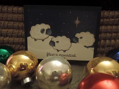
In the meantime, I've been card making.  I decided that I wanted to see if I could make our Christmas cards this year.  I kept it fun by playing with supplies (it should be fun, shouldn't it!?), working on several different designs.  When the time came to replicate them, I just made 4-6 of each one. 

We needed about 60 cards, and I had great fun making them.  The designs are saved on Flickr.  For those who are interested, go take a look.  I apologize that they are scans, but I haven't brought my love of photography together yet with card making. 


Ten I Am Sentences

I enjoy the Carole Knits blog.  Each Tuesday she has a blog starter called 10 on Tuesday.  I rarely participate, but the one today caught my imagination, and since the knitting blog is back up and running, I thought I would give it a try.

Carole suggests that the blogger write 10 sentences that start with the words I am.
  • I am ... knitting two scarves, a pair of socks, and a shawl that may never get done.
  • I am ... tired.   It's after 10:00, and at that time of night, my eyes start to get heavy.
  • I am ... anxiously awaiting the movie Monument Men.  It looks like it will be good.
  • I am .. not ashamed to say that the movie Frozen is one of my favorites this season.  I just loved it, and I would love to see it again.
  • I am ... reading a book about team building and then will have to move to one that I need to read for church.  I would rather be reading a Nora Roberts book.
  • I am ... learning how to use Photoshop.  I just finished a book about Lightroom.  After I finish Photoshop, I'm moving on to Illustrator.  As you may be able to tell...
  • I am ... a new subscriber to Adobe Creative Cloud.  So fun to have access to all of these programs.
  • I am ... the owner of a new iPad Air, which I am loving.  I did own an iPad 2.
  • I am ... hoping to buy a Kindle Kindle Paperwhite, but the 3G version is backordered.
  • I am ... a tech geek, and I don't care who knows it.

Return to Blogging

It's January of 2014, and it has been 15 months since I posted last.  My poor knitting blog.  I really
like having it, and I enjoy looking back at it, but I don't seem to find the time to keep it updated.

So, we'll try again.  I have several projects to add and to update. I will probably backdate them, but don't be fooled; they were just added.

It's been cold here, although today is like a spring day.  It you don't like the weather, stick around a while.  It will change.  Today is in the 60s; we were at -3 earlier in the week.

So, on to knit blogging.